Color in design evokes emotion and is very subjective. Color Theory explains how colors interact and can influence each other. Color Theory divides color down into their primary shades of red, yellow, and blue; these three colors are “pure” since they are not mixed with any other colors to achieve their effect. Secondary colors are formed by mixing together one or more primary colors; secondary colors are orange, green, and violet. Tertiary colors are formed by mixing two or more secondary colors; examples of tertiary colors are blue-green, red-violet, yellow-orange, and blue-violet.


To better understand color, the Color Wheel can visually explain how the various colors interact. As you can see below, the Color Wheel visually illustrates warm versus cool colors. The colors red, orange, and yellow are associated with warmth (located on the right side of the color wheel), such as the sun’s yellow color. Cool colors such as blue, green, and violet can remind us of the pale blue sky.
 Monochromatic Color Scheme
 Analogous Color Scheme
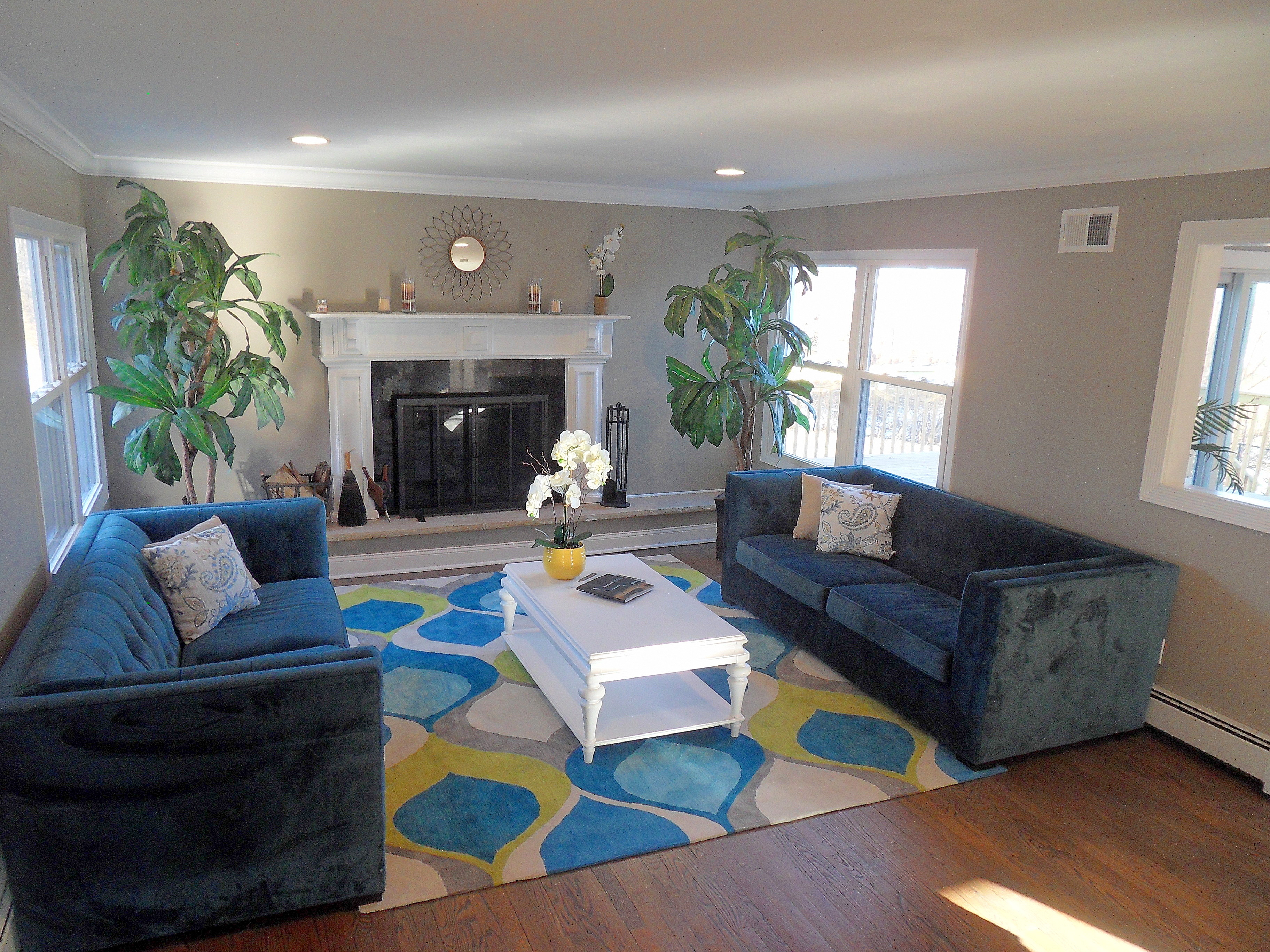
 Complementary Color Scheme
Analogous colors are a palette of colors that sit next to each other on the color wheel; they tend to blend easily together. (To learn more about Analogous Color Schemes, please see guest blogger Charisse Colbert’s post below.) Complementary colors are on the opposite side of the color wheel; these colors generally enhance and intensify each other. Complementary colors can create a sense of enthusiasm and excitement based off their contrasting tones. Monochromatic colors use variations in lightness and saturation of a single color; this color scheme tends to be very soothing since there is only one color being used in the space. There are more color schemes which will be discussed in a future blog – so please check back.
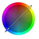
Today, we are focusing on Complementary color schemes and how they work together. Complementary color schemes work well when you use a warm color against a cool color. This color scheme offers a higher contrast than the analogous color scheme.
 This color wheel is highlighting how the Complementary Color Scheme works; to create a room design using this scheme you must select a color on the opposite side of the Color Wheel. For example, you can create a room design with a blue/orange color scheme or a yellow/violet color scheme.
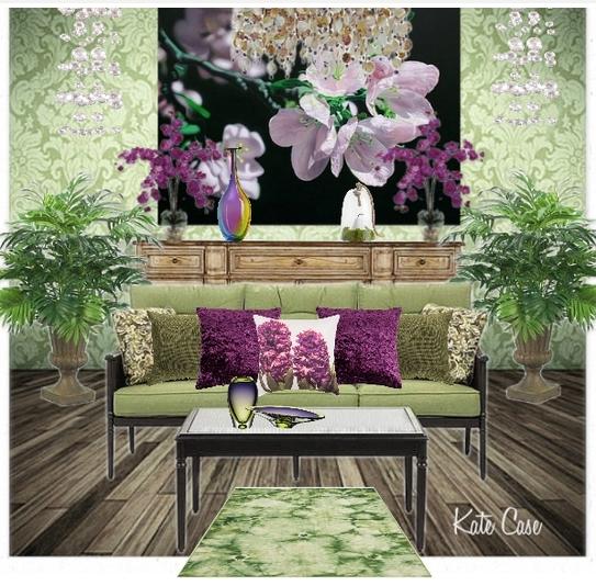
Violet and Green Room Design by Kate.
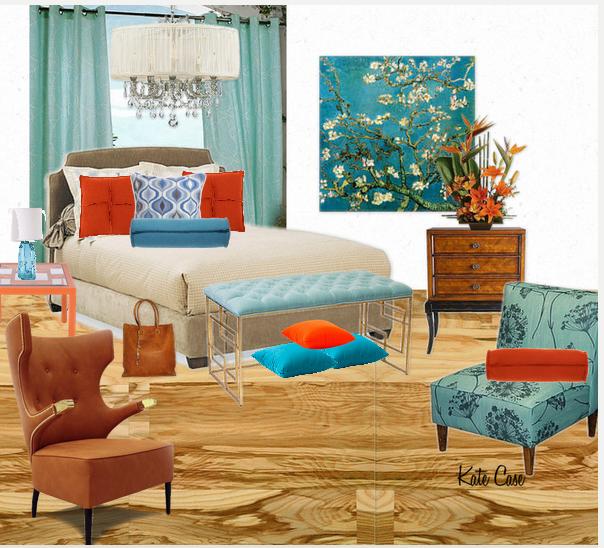
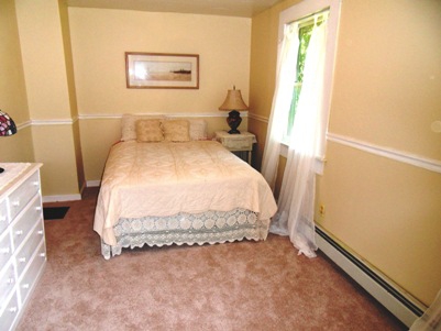
Blue and Orange Bedroom Design by Kate.

Yellow and Violet Girl’s Room Design by Kate.
Color can have a huge affect on our emotions and it can influence how we see things. I hope you enjoyed my Complementary Color Room Designs and check back soon for more color schemes designs.
*****************************************************************************
Thanks for stopping by.
Kate, owner/designer at Kate’s Home Staging and Interior Design, to schedule your design appointment please call Kate at (845) 538-3623. If you are interested in purchasing any of the home decor items displayed in the above room designs, please just click on the pictures and you will be taken to my Project Decor Design Shop.
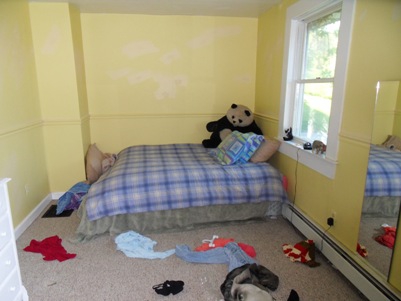


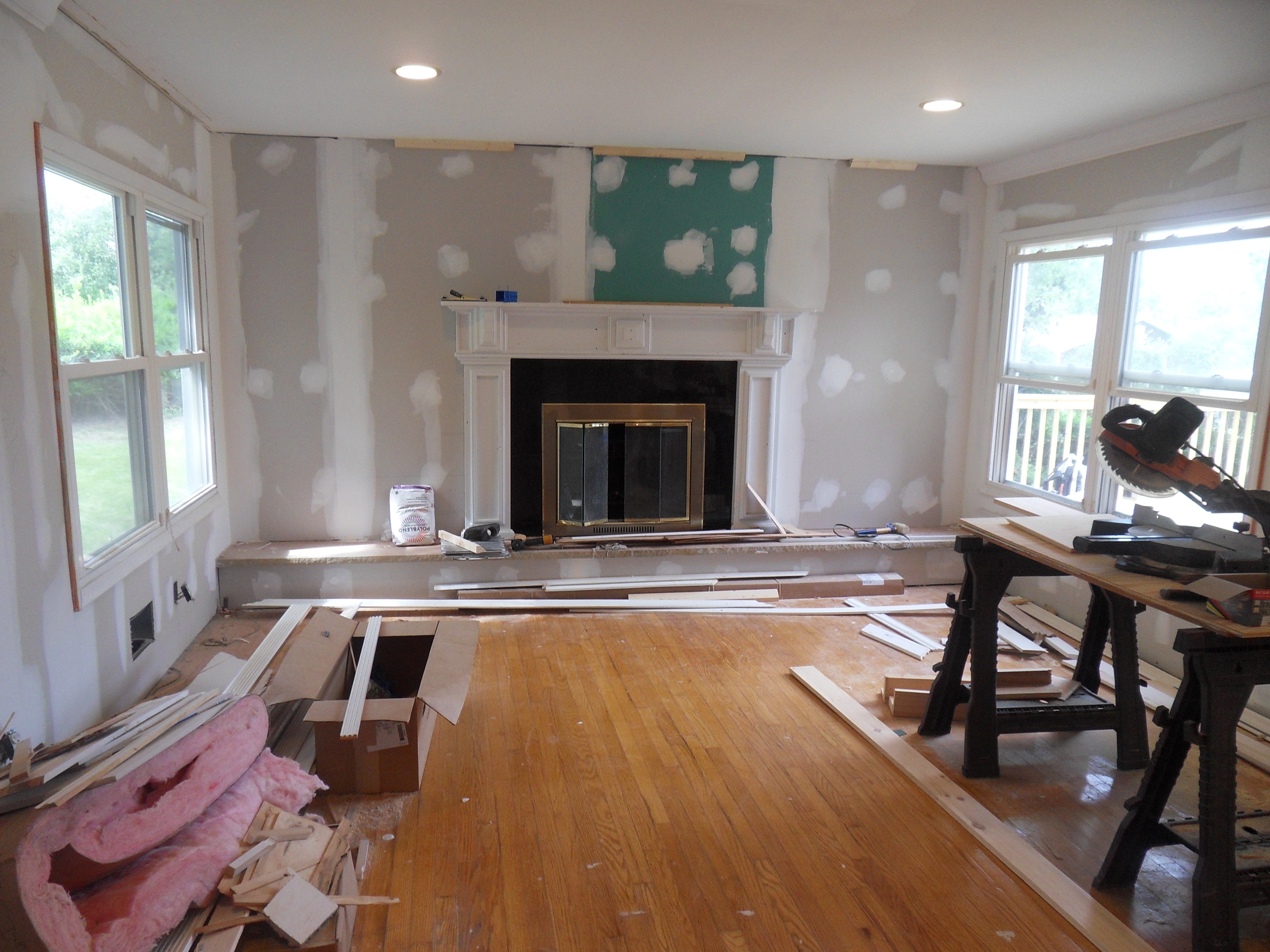
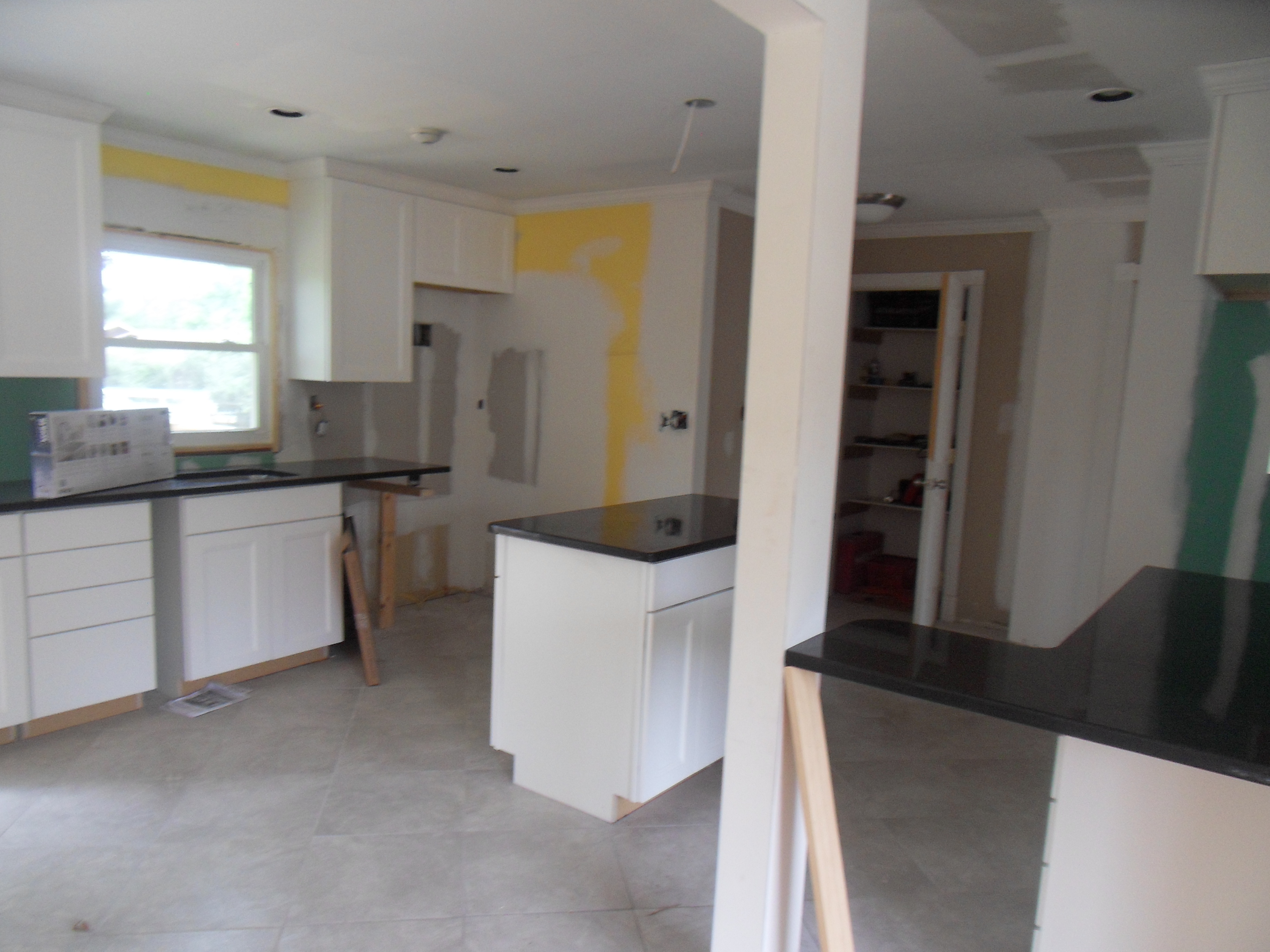


 Before My Paint Color Consultation